csspages
FlexBox Layout in CSS

The FlexBox layout is initiated with the display: flex; property and you can control how the children of the element are laid-out inside the parent on the webpage.
The flexbox layout plays probably plays a very important role in planning a responsive web layout.
(CSS)
.parent {
	display: flex;
	... other properties
}
For the display property, the flex value can be alongwith inline (display: inline flex or display: inline-flex) to define inline flex containers and with block (display: block flex or display: block-flex) to define block flex containers. flex used by itself defines a block level containter
(HTML)
<div class='parent'>
	<div class='child1'>
		...content of child 1
	</div>
	<div class='child2'>
		...content of child 2
	</div>
	....
</div>
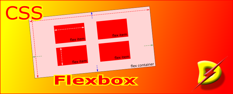
Each item inside a flexbox is called flex item and the flexbox itself is referred to as the flex container.
The layout of flex items can be in either horizontal or vertical direction.
Main Axis and Cross Axis
The direction in the items are laid out is known as the main axis and the direction perpendicular to the main axis is known as the cross axis.
By default, row is the main axis, this can be changed by specifying the desired flex-direction.
The size of a flex item along the main axis is identified as the main size, where as its size along the cross axis is the cross size
Properties for the flexbox
Flexbox has some properties applicable at the parent and child levels that can be used to create innovative layouts.
| Parent Level Properties | Child Level Properties |
|---|---|
flex-direction |
flex-grow |
flex-wrap |
flex-shrink |
justify-content |
flex-basis |
justify-items |
justify-self |
align-content |
align-self |
align-items |
order |
column-gap |
|
row-gap |
|
| Shorthands | |
flex-flow |
flex |
place-content |
place-self |
place-items |
|
gap |
At parent (or container) level…
Here are the properties that must be specified for the container element to control the flow of flex items in it.
-
determines the direction in which the successive items is to placed in the flex container.
When the direction is
roworrow-reversethe main axis is in the horizontal direction.
Similarly, when the direction is
columnorcolumn-reversethe main axis is in the vertical direction.
Note
When flex-direction: row, then default
widthof container is100%, andWhen flex-direction: column, the default
heightis the height required to render the content. -
determines whether are items will be laid out on one line or may flow onto multiple lines.
-
This is the shorthand property for…
-
justifies the overall content along the main axis.
-
sets the justification of the individual elements along the main axis within the dimensions designated to it after
justify-contentis processed.This setting applies to each of the elements in the flexbox, unless a
justify-selfis specified to an element at the child level. -
Aligns the overall content along the cross axis.
-
Aligns the indiviual elements along the cross axis within the dimensions designated to it after
align-contentis processed.This alignment is applied to each of element in the flexbox, unless a
align-selfis specified at the child level. -
This is a shorthand property for
align-content, andjustify-content.
If one value is provided, that value applied to both
align-contentandjustify-content.If two values are provided, the first will be for
align-contentand the second will be forjustify-content. -
This is a shorthand property for
align-itemsandjustify-items.
If one value is provided, that value applied to both
align-itemsandjustify-items.If two values are provided, the first will be for
align-itemsand the second will be forjustify-items. -
Determines the gap between columns in the
flexbox. Also works forgridandmulti-columncontainer. -
Determines the gap between rows in the
flexandgridcontainers -
This is the shorthand property for…
At child level…
Below are the properties that may be specified to control the rendering of the flex items.
-
This is shorthand property for…
-
This determines how the positive free space in the flex container is assigned to the main-size of the item i.e. it specifies the grow factor for an item.
-
This determines how the negative free space in the flex container is assigned to the main-size of the item i.e. it specifies the shrink factor for an item.
-
This specifies the initial main size for the flex item. The final computed main size will depend when the
flex-growandflex-shrinkvalues are applied to this. -
This property overrides the
justify-itemsproperty defined for the flex container. -
This property overrides the
align-itemsproperty defined for the flex container. -
This property overrides the
place-itemsproperty values provided for the flex container. -
The
orderproperty defines the sequence in which each flex item is rendered.